Why Book Spine Wall Art Is Trending in Interior Design
27 August 2026 • By Kamil Safulak, Antykwariat Polski
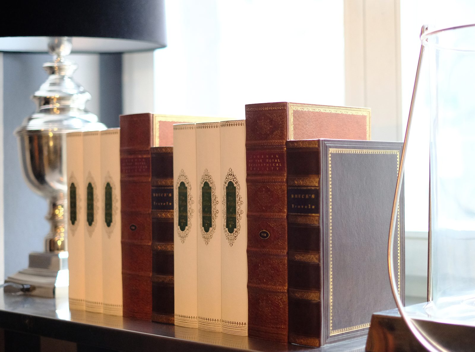 Photo: Antykwariat Polski
Book spine wall art has moved from a niche curiosity to a recurring line item in interior design briefs, and the reasons behind that shift are worth unpacking rather than simply accepting as a trend. Below are the questions we hear most often from designers and architects specifying it, and from private clients trying to understand what they are actually buying.
What exactly counts as book spine wall art?
In practice, the term covers a range of formats. At the simple end, it means individual leather or cloth spines mounted flat against a panel to suggest a run of books without any volume behind them. At the more elaborate end, it includes decorative book panels built with real depth and texture, sometimes with supports so they read convincingly from an angle rather than only from straight on. The common thread is that the spine - its color, tooling, lettering, wear pattern - becomes the design element, independent of whether there is a readable book attached to it.
Why are designers specifying it instead of real books?
Real book collections are unpredictable. Spine heights vary, colors clash, dust jackets fade unevenly, and building a wall of genuine antiquarian volumes that reads as a cohesive palette can take years and a serious acquisitions budget. Book spine wall art solves a composition problem: it lets a designer treat a wall the way they would treat a fabric or a paint finish, choosing a tonal range, a rhythm of heights, and a level of patina that supports the rest of the room rather than fighting it. For hospitality and corporate projects especially, this predictability matters as much as the aesthetic itself - a lobby or a boardroom needs to look finished on installation day, not in a decade.
Is this only relevant for libraries and studies?
No, and this is part of why the trend has broadened. Library wall decor built around book spines now shows up in hotel corridors, private cinemas, wine cellars, dressing rooms, and reception areas that have nothing literally to do with reading. The spines function as a texture and a narrative device - they suggest history, permanence, and intellectual weight in spaces that would otherwise rely on art or millwork to do that work. A well-composed spine wall can anchor a room the same way a large abstract painting would, but with a warmth and tactility that paint doesn't offer.
How do designers avoid it looking like a stage prop?
This is the most technical question, and the honest answer is that quality control happens at the level of material and detail. Convincing spine work uses real leather or leather-look materials with correctly proportioned raised bands, foil or blind-stamped lettering, and color variation that mimics genuine aging rather than a uniform factory finish. Scale matters too - spines sized to match plausible book formats, mixed slightly in height and depth, avoid the flat, repetitive look that reads as artificial from across a room. Projects that need to withstand close inspection, such as law office design where clients and visitors interact directly with the shelving, tend to demand a higher standard of finish than a purely decorative install viewed from a distance.
Where does this fit into a broader shelving or millwork plan?
Book spine wall art rarely stands alone in a serious project. It is usually specified alongside built-in cabinetry, and the panels are planned into the millwork drawings from an early stage rather than added afterward. Designers working with built-in bookshelf layouts often mix genuine books, decorative spines, and object styling across the same run of shelving, using the spine panels specifically to fill sections where real books would be impractical - very tall voids, curved bays, or areas exposed to humidity or light that would damage actual paper and binding.
What should a designer ask a supplier before specifying it?
Ask about the substrate and how panels are fixed, since this affects both installation timeline and how the work reads up close. Ask whether spine colors and tooling can be adjusted to match a existing palette, since off-the-shelf runs rarely suit a bespoke interior without some customization. And ask for physical samples before committing to a full wall - photographs compress texture and tone in ways that can mislead even an experienced eye.
Contact us to discuss a bespoke project, or browse our library arrangements and styling catalogue.